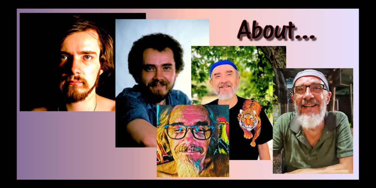
Figurative Artwork – a summary and the long version (TL;DR)
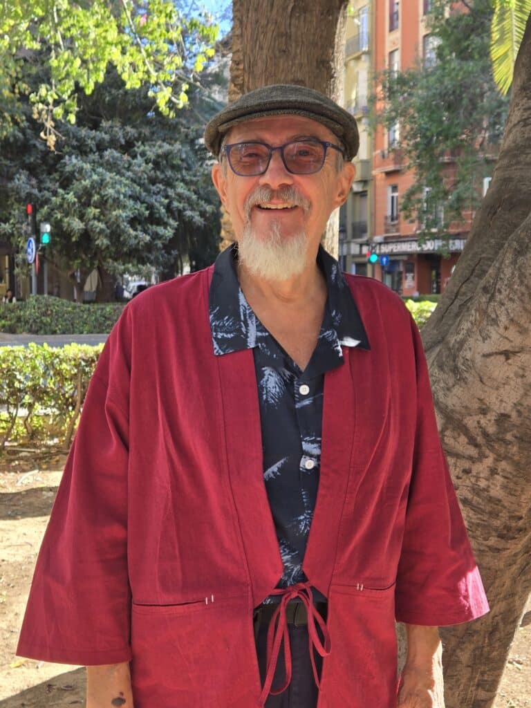
Figurative Artwork Summary
Art, for me, is rooted in the tangible world—an ongoing exploration of the human figure, everyday encounters, and the subtle narratives woven into ordinary moments.
My journey began in the 1960s, but it was during my formative years at Elmhurst University that I first understood the complexity and richness of seeing. What started as a search for accuracy in hyperrealism gradually evolved into a more expressive, figurative approach—one that values emotional resonance over strict representation.
Working exclusively in acrylic, I build each painting from my own photographs or from online images. I use my camera as a tool to capture fleeting gestures and the quiet drama of daily life. The process is never about replication; instead, it’s about distilling reality through my own vision—loosening forms, blocking in colour, and allowing the paint to suggest as much as it describes.
Over time, I’ve come to see colour not just as surface, but as a language for shadow, mood, and memory.
My work revolves around three central themes: nude figure studies, portraits, and scenes from everyday life. Whether painting a solitary figure or a crowded street, I’m drawn to the emotional undercurrents that connect us all. I believe figurative art is at its most powerful when it balances observation with interpretation—when it invites viewers to find their own stories within the familiar.
Ultimately, I see myself as a chronicler of the present moment—a “simple Zen guy” who finds meaning in the here and now. My paintings are an invitation to pause, to look again, and to discover the extraordinary within the ordinary.
Featured Paintings


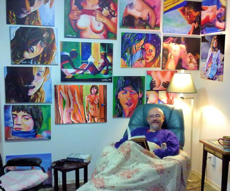
in the Studio.
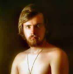
I wasn’t always into figurative artwork.
I suppose that my “arts education” began at Elmhurst University. I’d painted a couple of things in oil while in High School, and they were “ok-ish,” but then… Art class.
The very first thing we were asked to do was to paint a portrait from a live model. Being me, I painted her on plexiglass, and mounted the plexiglass on a box full of twinkling lights.
The next painting was taken a magazine cover. It was a photo of a mom, dad, and baby, cuddling. I loosened the image up a bit, but my colour palette was pretty bland.
These early experiences were pivotal, shaping my understanding and appreciation of figurative artwork.
My art Prof gave me an “A”, but then, fatefully, asked me, “Can’t you see the colours in the shadows?”
Given the number of recreational substances he and the rest of us were taking back then, I guessed he was tripping.
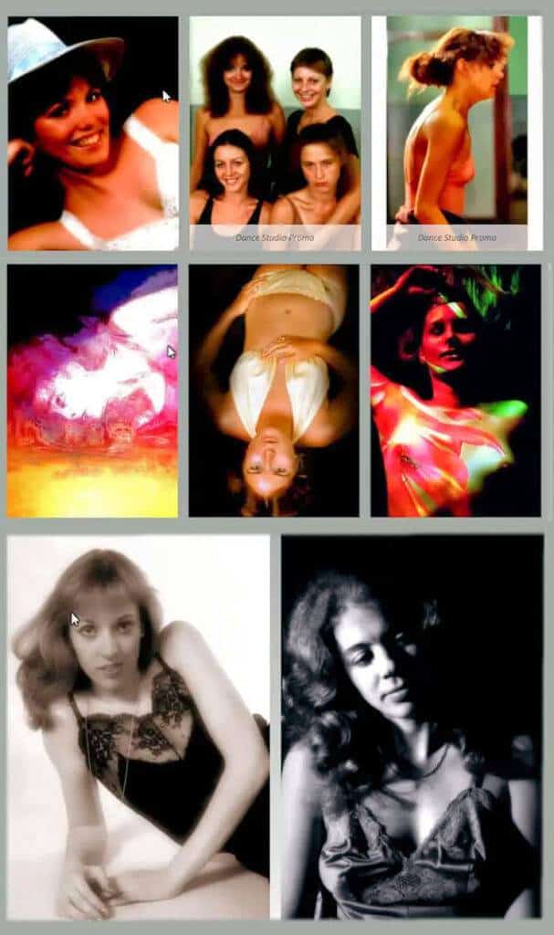
Chicago Photo Studio
After I graduated in 1973, I pretty much stopped painting, Some years passed as I focussed on photography. I opened a studio in a suburb of Chicago, and did model photos, figure studies and ad work.
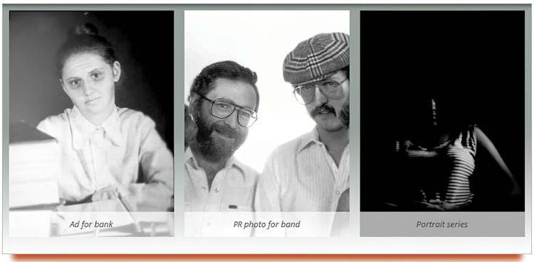
The Move to Canada
I moved to Canada in 1975, and opened a studio in Ontario. My main focus was portraits, although I also did advertising work for local artists and companies.
Rediscovering Painting – hyper-realism
Flash forward to the early 80s. I tripped over some art supplies and decided to start painting again. The paintings were large, and took forever, as I’d discovered hyper-realism.
I think I was initially enamoured with hyper-realism because I’d spent so many years learning to take good photos.

Acrylic on Masonite
NFS
My hyper-realism stage lasted a few years; a couple of my paintings from way back then have an almost photographic quality. The downside, for me, was that the images have a bit of a “flatness” to them.

Acrylic on Masonite
NFS
This portrait has a story: a friend wanted to learn to take photo portraits. Her friend came along to pose. She liked posing so much, I photographed her 2 more times.
This painting clearly demonstrates my hyper-realism stage.
I began to work with a broader colour range.

Acrylic on Masonite
NFS – private collection
Here’s a flash-back to a quasi-realistic style, but… there is less of an emphasis on photo realism. And there are hints of what my Art Prof asked about…
I’d finally noticed that there WERE colours in the shadows.

Acrylic on canvas
Available
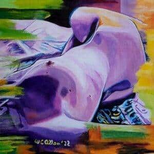
From 2000 through 2010, I further loosened my style. Much of my work back then featured a more stylistic, “blocked colour” technique. I produced several paintings that feature the play of light and shadow.
Adapting and Adopting – Figurative Art.
To quote Wikipedia: “Figurative art, sometimes written as figurativism, describes artwork (particularly paintings and sculptures) that is clearly derived from real object sources and so is, by definition, representational. The term is often in contrast to abstract art.”
Since the arrival of abstract art the term figurative has been used to refer to any form of modern art that retains strong references to the real world.
LINK
This real world focus fit for me. My brain just doesn’t compute abstraction. I like the “here and now” reality of figurative art (I’m a simple Zen guy, after all.)
Realism dictates an almost exact matching of what is “right there.” In a figurative world, the realism remains, but is overwritten by the artist’s vision of how to bring out the emotions contained in the scene.

Acrylic on canvas
Available
Figurative art is a way of expressing what I’m seeing – what lies beyond the details. Each painting I create has a very real basis in reality, but also captures a playful sense of emotion – the colour in the shadows!

Acrylic on canvas
Available
I’ve always loved the human form, and that also features heavily in my art. In a sense, it dovetails with my love for photography.
This painting is one of several from a lazy afternoon photo shoot. It is all about colour hinting at the underlying emotion.
Commissions

Acrylic on Canvas
NFS
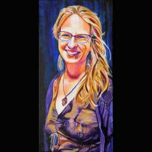
I finally settled on the perfect blend of figurative art and stylistic art around 2016. My commissioned portrait style “locked in” and seems easy.
Themes
My figurative artwork is a body of work that primarily revolves between three themes: nude figure studies, portraits, and “scenes from everyday life.” In each case, I follow my instinct to produce paintings that are identifiable as “mine.”
My process is to take a photo (or download an image) and to use a computer to edit it. I have a sense of where I want to end up and the technology means I’m able to shift colours, backgrounds, body shapes and positions, etc. before I transfer the image to canvas.
Figurative art needs a strong basis in reality; but I don’t believe it has to be accurate. It’s possible for creative expression to marry itself with my artistic vision.
I (finally!) found my niche.
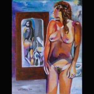
Here’s an analysis of one of my recent paintings:

Acrylic on Canvas
Available
This vibrant artwork captures a reclining figure rendered in a captivating interplay of colors. The bold and expressive use of hues such as blues, pinks, oranges, and purples gives the piece a dynamic energy, presenting the subject in a way that defies traditional realism. The contrast between light and shadow is emphasized through the artist’s selection of colors which, rather than sticking to a natural palette, creates a mood that is both striking and intriguing. The black background allows the figure to stand out, adding intensity and focus to the composition.
The artist demonstrates a commendable understanding of color theory, using complementary colors to produce depth and form within the piece. The boldness in execution suggests an influence of figuratism, where emotions and subjective perspective take precedence, offering viewers a glimpse into the inner world of the artwork. There’s an engaging interaction between warmth and coolness in the tones that speaks to the complexity of human emotion and experience.
One of the strengths of this piece lies in its ability to evoke curiosity and elicit an emotional response through its abstraction. The viewer is invited to interpret the mood and intention behind the unusual color choices, making the experience personal and engaging. Depth and movement are achieved not through detailed realism but through the strategic placement and layering of colors, which is quite effective.
This piece stands as a testament to the power of color and abstraction in conveying emotion. Art, after all, is a subjective experience, and this work certainly leaves a lasting impression while encouraging reflection and interpretation. Continue to explore and embrace these unique artistic choices, as they set your work apart and resonate with the viewer on a profound level.
Please do look around at both my paintings and a representative sampling of my photography.
Please note that some of my paintings and photographs are available as prints and wall art.
My style flexes back and forth between realistic and figurative art. I’ve worked to learn to “see” the colours in the shadows… my art Prof was on to something!
And I’m proud to be a figurative artist!
Please, enjoy!